0%

Coinbase’s animated TabBar in React Native

May 19, 2021 12 min read
News Article Banner Image

It’s a simple tab component, with a scroll-away Header and TabBar that pins to the top of the screen. It allows you to swipe through the different TabViews, and it treats the overall scroll position intelligently (i.e. if you scroll past the Header on one TabView, switching tabs keeps the global header in the same position, irrespective of tab scroll).

However, despite how universal this UX experience has become, behind the scenes it still requires a large lift of complex gestures and state management to get it feeling and performing “just right” for the end user.

At Coinbase we were able to pull this off for our recent React Native rewrite and wanted to share a little bit more about the UX details that went into this interaction, as well as the code needed to make it happen.

Glossary of UX terms

Before we get started, let’s define some terminology that will help us describe the core components needed for pulling off this experience. We also extracted a simple companion example project — which you can use to follow along or help build your own working version of this experience.

  1. Header This is the top typographic lockup on the Screen.

  2. TabBar This is a list of tab buttons. It highlights the active tab and allows you to navigate between each TabView with a tap or swipe.

  3. TabView This is the scrollable tab content. This can be asset cells, tweets, photos, or any other content.

  4. NavBar This is the top screen navigation. You often see this with back arrows or other icons up here as well. But to keep it simple we just have a title.

  5. Screen — The top level container component (root level React component).

Beyond components we will also be referring to the following terms:

  1. Interpolation — Maps input ranges to output ranges, typically using a linear interpolation but also supports easing functions.

  2. FPS — Frames per second.

  3. Bridge Traffic — Messages being sent over React Native’s bridge between its javascript and native layer.

  4. Active TabView — The currently visible TabView.

  5. Inactive TabView — TabViews that are off screen (not currently visible).

Guide to interactions

There are a handful of key interactions that go into making the TabView look and feel organic. Many of these behaviors were identified through studying external implementations like Twitter and Instagram, as well as platform specific applications and specifications like Apple’s HIG and Google’s Material Design.

Here is a list of key interactions (all of which you will find in our sample project on github). Study the gif above to see if you can pick out each of these subtle behaviors.

  1. The NavBar should fade in/out with a timer based animation when the scroll reaches a certain position. Many people make the mistake of interpolating the NavBar title opacity based on the page’s scroll position. While this works really well when scrolling slowly, if you scroll more quickly (standard in day-to-day use of applications) you’ll notice the NavBar title will often transition in too abruptly.

    We first noticed this behavior when analyzing Apple Note’s UI, but you’ll see in all of Apple’s native applications (Apple Music, Mail, etc.) that they implement this same fade trigger point.

    The ideal trigger point for this animation is right as the Header title is obstructed by the NavBar.

  2. The Header should slide up and off the screen (beneath the NavBar) on scroll. This might seem obvious, but getting this right on React Native can be quite challenging. One important limitation of React Native is that there are no nested scroll surfaces. This has major consequences:

    a. Because TabViews must be independently scrollable (with their own independent scroll positions), the top-level Screen container cannot be scrollable.

    b. Because the top-level Screen container cannot be scrollable, we must simulate the effect that the top of the page is “scrolling” by interpolating the active TabView’s scroll position to a translateY offset for the Header. This transform gives the visual appearance of the Header scrolling with the TabBar and TabViews up and off the page, without actually scrolling the page (more on managing scroll position, and the complexity that comes with that in the implementation details below).

  3. The TabBar should slide up and then pin to the bottom edge of the NavBar.

    Similar to the Header, the TabBar must be slid up the screen using translateY. Unlike with Header, we need to cap the total distance the component can travel up the screen, to give the effect that the tabs are pinned beneath the NavBar.

  4. Once the TabBar is pinned, a bottom border should be faded in to add depth to TabViews sliding beneath it. Unlike with the NavBar, the bottom border opacity should be interpolated in direct correlation to the scroll position. The reason we do this is to guarantee that the border is always opaque whenever TabViewis passing under TabBar.

  5. TabView should scroll up and pin directly beneath the TabBar, ensuring that anytime you swipe or navigate between TabViews, the header position is always correctly maintained. Like TabBar, Tabview should appear visually pinned beneath TabBar. Once pinned, the TabView content should appear to scroll beneath the pinned TabBar.

Implementation

Mobile users are accustomed to smooth and well-designed interfaces that quickly respond to their interactions and provide prompt visual feedback. At Coinbase we use custom tooling to track and measure our fps, aiming to keep key interactions like navigation, gestures, etc. at 60fps. In order to do this in React Native, it’s imperative that we both limit bridge traffic (reducing JS-driven animations) and reduce render cycles (minimally update state/context api).

Performance concerns, coupled with React Native’s limitation around no nested scroll surfaces, means our best option for powering the above interactions is to manage a single, shared Animated.Value (that we call ScrollY).

To populate our Animated.Value we use React Native’s event method and native driver, adding the below snippet to TabView’s onScroll event.

https://medium.com/media/2a0ae563db797cc8dc5149aae7d4805c/href

Note: We update the scrollY event here based on whether a given tab is active. This makes sure there is only ever a single TabView updating scroll positions at any given time.

Now that we have ScrollY management locked in, we can begin to interpolate its value across our different components to achieve the interactions covered above.

  1. The NavBar title should fade in/out with a timer based animation when the scroll reaches a certain position.

Here we set a listener for our scrollY value change. When this value changes, if the scroll distance covered is 60% of the Header (meaning the header has traveled upward beneath the NavBar and 60% of its height is covered by the NavBar), we trigger a 300ms native opacity animation for the NavBar title. Because our Navbar is fixed to the top of the Screen, we don’t have to worry about any complex positioning or offset logic.

https://medium.com/media/b03bdaa8cabefc5d3d1e071fbf119450/href

2. The Header should slide up and off the screen (beneath the NavBar) on scroll.

The React Native interpolation API takes a value that changes over time and interpolates it based on a range of inputs (e.g. 0 to 1) and outputs it to a given range (e.g. 0 to 100). So for example, if we had an Animated.Value updated to 0.3 and ran through the below interpolation, the interpolated output would be 30.

https://medium.com/media/82e9c78f3b8d758d1bfe17655a4583c2/href

With this in mind, let’s consider our Header interpolation.

https://medium.com/media/40670c20d52998e73fab464312887371/href

Here we are interpolating a ScrollY value that should theoretically have an input range of 0 (top of scroll) and our Header height (let’s say 80pt).

There is a bit of nuance here however because of how iOS treats 3 scenarios: pull to refresh, rubberbanding, and overscroll.

Inside our TabView we provide special contentInset and contentOffset patterns for iOS. This allows our “pull to refresh” spinner to correctly pull down beneath our Header (visually at the top of TabView).

Note: We are able to achieve the same affect in a simpler manner on Android by simply applying a paddingTop to our contentContainers style. We are able to get away with this on Android because it doesn’t have overscroll.

https://medium.com/media/d1fdb79252cfd913525359a88dec4465/href

When returning to our Header interpolation, the inputRange used must be different for iOS (to account for the contentOffset). Specifically:

https://medium.com/media/57a13574e2a8e8df33fb7aafe5a4ba19/href

The final thing to note here is that we are interpolating those input values (ScrollOffset to ScrollOffset + Header) to an output range of (0 to negative Header height). And we’re using React’s interpolate “clamp” value to prevent the output value from exceeding outputRange (whereas the default is “extend” which will exceed our outputRange).

The result is that as you scroll TabView the header will be transformed up and off the screen until it is completely hidden (negative Header), and no further.

https://medium.com/media/764cfa006bcc09fb9a7601e0360ee188/href

3. The TabBar should slide up and then pin to the bottom edge of the NavBar.

By default, the TabBar is rendered inside of the react-native-tab-view’s TabView component using { position absolute, top: 0 }, which effectively gives us the visual “pinning” effect.

The trick here is we’re using interpolation to first push the TabView further down the screen then it’s natural render position (unlike we did with our Header component), and then using ScrollY change events to transform it back to it’s natural 0 placement. This is why our output range in the below invocation sets an initial transform of the height of the Header, and translates it up into it’s pinned final pinned position of 0.

https://medium.com/media/60d0d00f7400cb84776e4d26bd26af0e/href

  1. Once the TabBar is pinned, a bottom border should be faded in to add depth to TabViews sliding beneath it.

To fade the border in, we set an input range from the top of the Header to the Header + TabBar Height. This ensures that the border doesn’t begin fading in until the header has been scrolled out of view, and that it is completely faded in by the time the TabView children scroll beneath it.

We then interpolate the value to an outputRange of 0 to 1, which is the value range for the opacity property in React Native.

https://medium.com/media/e5f1cf232240e9f45bbeb327fe3ba123/href

5. TabView should slide up and pin directly beneath the TabBar, ensuring that anytime you swipe or navigate between TabViews, the header height is always correctly maintained

This is arguably the most difficult piece of this entire architecture. Relying on a single ScrollY value greatly simplifies the above interpolations, however it becomes problematic as soon as you begin to take into account inactive TabViews. If you aren’t doing something to proactively synchronize inactive scroll views, then navigating between TabViews will display scroll positions at incorrect placements (as the inactive TabViews won’t have compensated for the Header being shown or hidden).

To solve this we must populate the following 4 variables.

  1. index The active tab index, provided by our Tab library react-native-tab view.

https://medium.com/media/642e6f2a681f797c1779a5085d35d225/href

2. tabKey The tab identifier, provided by our Tab library react-native-tab-view and passed down to individual TabView components.

https://medium.com/media/f617a88b0aba8acff3161ae5865be73d/href

3. tabkeyToScrollableChildRef This is a map of tab identifiers to scrollable component refs (TabViews). It will be used later to passively update all inactive TabView scroll offsets.

https://medium.com/media/11a73d9580498507536a79eab592a651/href

4. tabkeyToScrollPosition This is a map of tab identifiers to their local scroll position. It will be used to compare cached scrollPositions to Header offsets to determine if inactive TabViews scroll offsets need to be adjusted.

https://medium.com/media/09b36ccb9b0f66df76cf07a462eff654/href

To begin synchronizing scroll offsets, we first start by populating tabkeyToScrollableChildRef using React’s special ref prop. When you pass a method to the ref prop in React, the incoming method is invoked with a reference to the component. We then take this reference, along with a TabView’s local TabKey reference (passed in by react-native-tab-view), and call up to our trackRef method.

https://medium.com/media/5c94cbbc7561497f9ade1ac3470d606a/href

Next we populate our tabKeyToScrollPosition map by listening in on our global ScrollY value and inferring the activeTab by mapping index to our tabs array. This allows us to know where all of our tabs are scrolled (even inactive tabs) at any given time.

https://medium.com/media/50b937eb46dfe94777413c2be450d5a1/href

The final step to synchronize scroll offsets is to make use of onMomentumScrollEnd and onScrollEndDrag eventsto invoke a custom method we call syncScrollOffset.

SyncScrollOffset iterates through inactive TabKeys and updates their scroll offsets depending on if the Header is scrolled in or out of view. Doing so will ensure that anytime you swipe or navigate between TabViews, the header height is always correctly maintained.

https://medium.com/media/68bd2a308c4653801afcb118ef7e920c/href

Summary

At Coinbase, we’re spending a lot of time getting these interactions as close to perfect as possible. An important part about our transition away from Native technologies to React Native has been about not only maintaining our quality bar, but raising it. This happens through deep UX investments, our multi-platform design system, and more.

If this type of work interests you, or if you have any questions about the above implementation, please don’t hesitate to reach out and check out our job board — we’re hiring!

And check out our previous posts on our React Native journey such as Onboarding thousands of users with React Native and Optimizing React Native.

This website contains links to third-party websites or other content for information purposes only (“Third-Party Sites”). The Third-Party Sites are not under the control of Coinbase, Inc., and its affiliates (“Coinbase”), and Coinbase is not responsible for the content of any Third-Party Site, including without limitation any link contained in a Third-Party Site, or any changes or updates to a Third-Party Site. Coinbase is not responsible for webcasting or any other form of transmission received from any Third-Party Site. Coinbase is providing these links to you only as a convenience, and the inclusion of any link does not imply endorsement, approval or recommendation by Coinbase of the site or any association with its operators.

All images provided herein are by Coinbase.

was originally published in The Coinbase Blog on Medium, where people are continuing the conversation by highlighting and responding to this story.

Popular news

How to Set Up and Use Trust Wallet for Binance Smart Chain
#Bitcoin#Bitcoins#Config+2 more tags

How to Set Up and Use Trust Wallet for Binance Smart Chain

Your Essential Guide To Binance Leveraged Tokens

Your Essential Guide To Binance Leveraged Tokens

How to Sell Your Bitcoin Into Cash on Binance (2021 Update)
#Subscriptions

How to Sell Your Bitcoin Into Cash on Binance (2021 Update)

What is Grid Trading? (A Crypto-Futures Guide)

What is Grid Trading? (A Crypto-Futures Guide)

Start trading with Cryptohopper for free!

Free to use - no credit card required

Let's get started
Cryptohopper appCryptohopper app

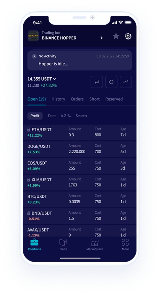
Disclaimer: Cryptohopper is not a regulated entity. Cryptocurrency bot trading involves substantial risks, and past performance is not indicative of future results. The profits shown in product screenshots are for illustrative purposes and may be exaggerated. Only engage in bot trading if you possess sufficient knowledge or seek guidance from a qualified financial advisor. Under no circumstances shall Cryptohopper accept any liability to any person or entity for (a) any loss or damage, in whole or in part, caused by, arising out of, or in connection with transactions involving our software or (b) any direct, indirect, special, consequential, or incidental damages. Please note that the content available on the Cryptohopper social trading platform is generated by members of the Cryptohopper community and does not constitute advice or recommendations from Cryptohopper or on its behalf. Profits shown on the Markteplace are not indicative of future results. By using Cryptohopper's services, you acknowledge and accept the inherent risks involved in cryptocurrency trading and agree to hold Cryptohopper harmless from any liabilities or losses incurred. It is essential to review and understand our Terms of Service and Risk Disclosure Policy before using our software or engaging in any trading activities. Please consult legal and financial professionals for personalized advice based on your specific circumstances.

©2017 - 2024 Copyright by Cryptohopper™ - All rights reserved.